Research Cloud Design System
Problem Statement
Research Cloud is Vibrent Health’s enterprise product; with several modules to help health researchers recruit, engage, and retain participants in their research studies.
The product was built without a style guide or creative oversight.
Countless UI inconsistencies.
Outdated design that didn’t account for WCAG accessibility/ 508 compliance.
We had three designers supporting one product without one source of design truth.
What We Did
Audited the tool and compiled proof of color, type, size, and component inconsistencies.
Researched best practices, accessibility, and resources such as Google’s Material UI Kit in order to build our own system.
Created a design system using Adobe XD’s Creative Cloud Library and utilizing the integration with Zeplin Styleguides.
Now, designers are able to efficiently pull pre-made components and text styles into their designs, and developers have a reference guide for the correct UI standards to follow.
My Role
This project has been a wonderful collaboration with my Design Director and fellow UI/UX Designer.
I own and lead this effort, and am the point of contact for developers, engineers, and any visual quality assurance questions. I created pixel-perfect components, implemented and maintain a naming convention, and utilized atomic design organization for our file.
This project is ever-evolving and still considered a work in progress, but has already vastly improved our workflow.
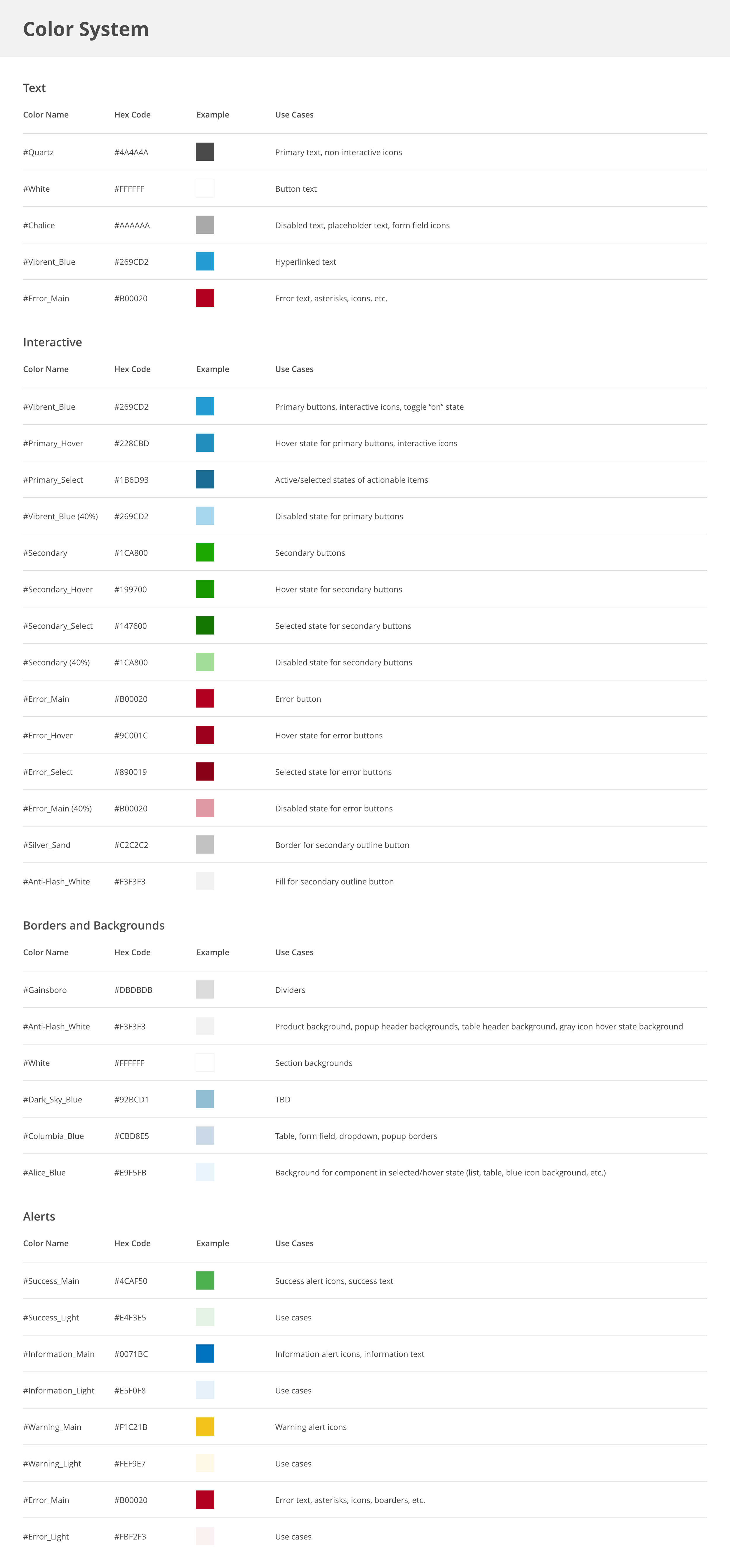
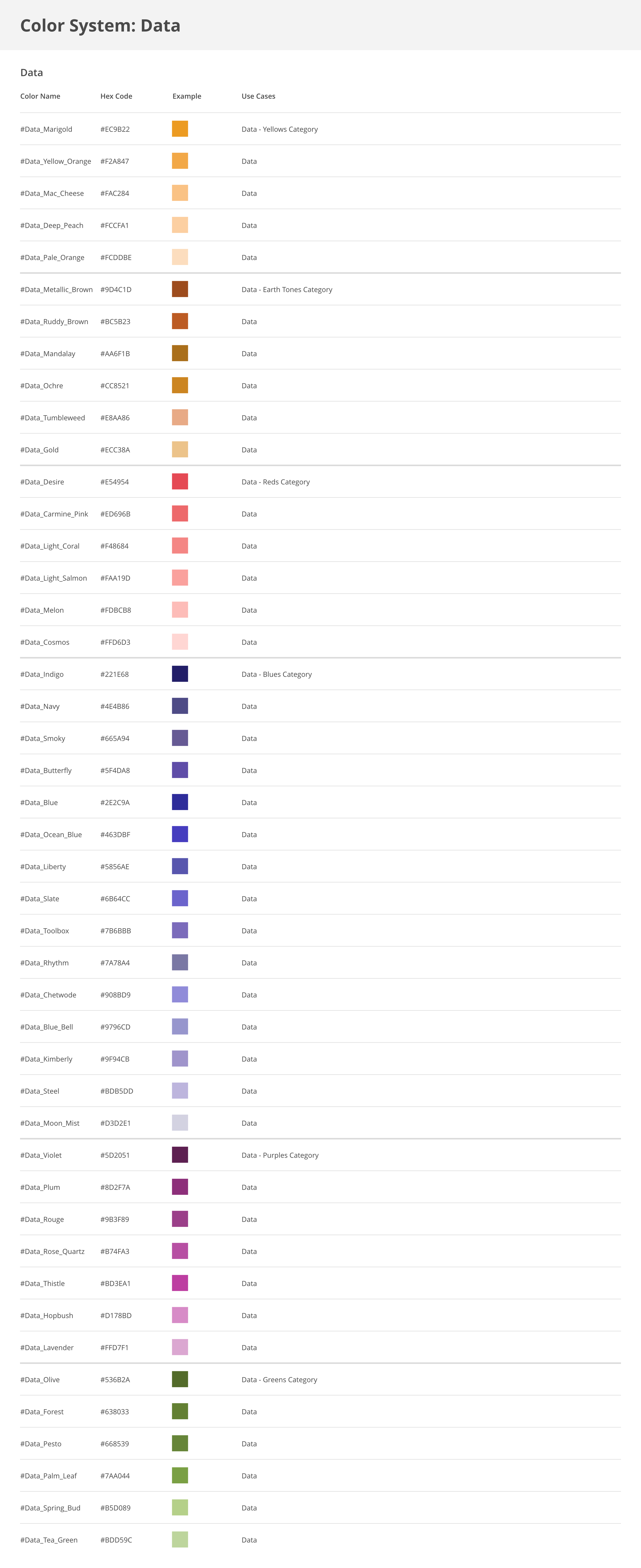
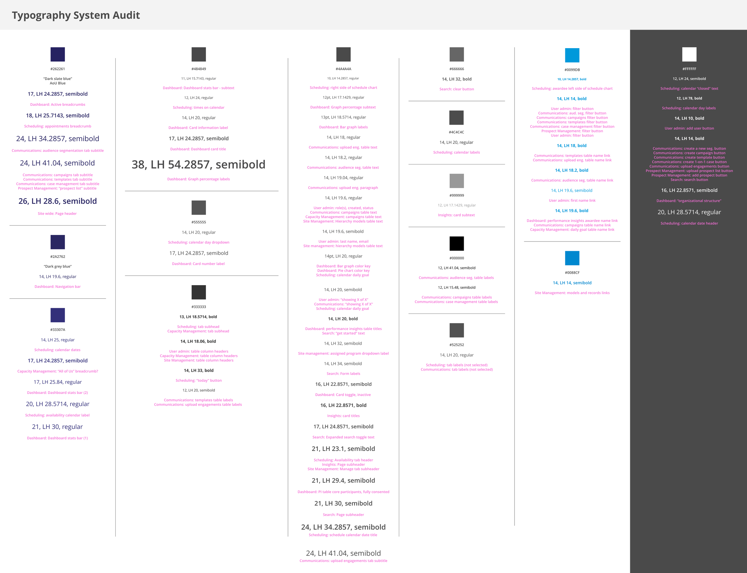
Color and Typography
Audited all the color and typography inconsistencies throughout the product.
Researched and implemented WCAG accessibility color guidelines and best practices.
Created a naming convention for ease of use when conducting visual quality assurance and communication with the development team.


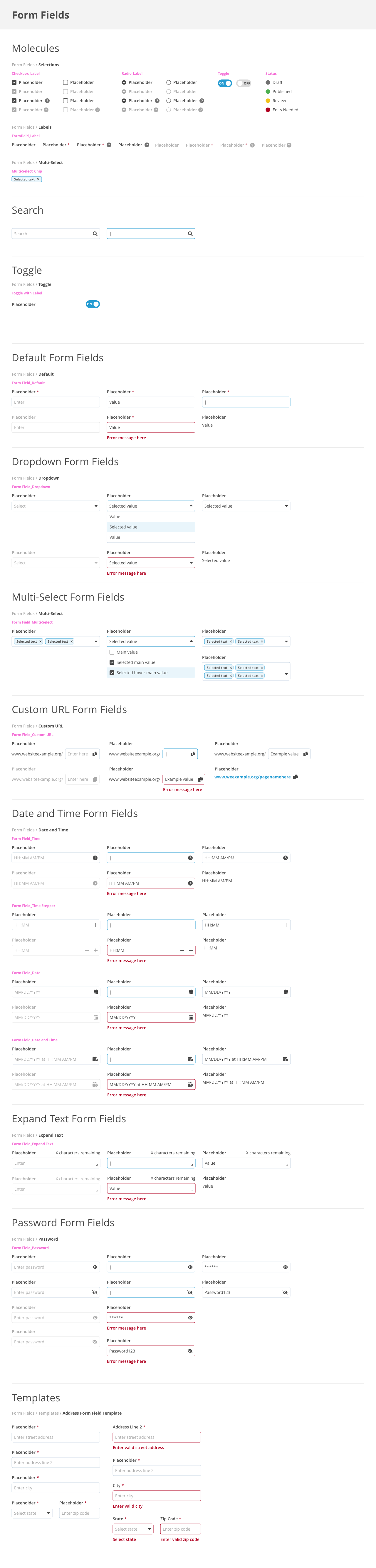
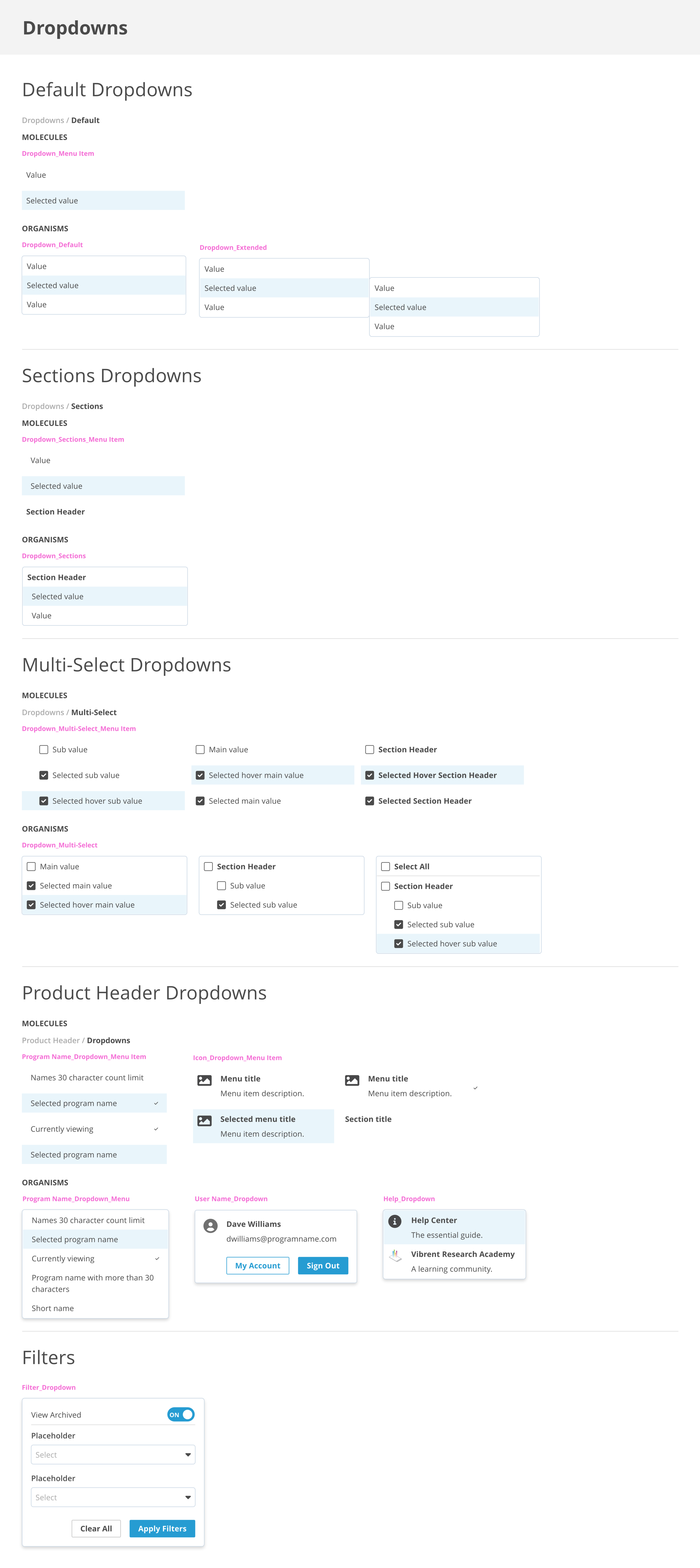
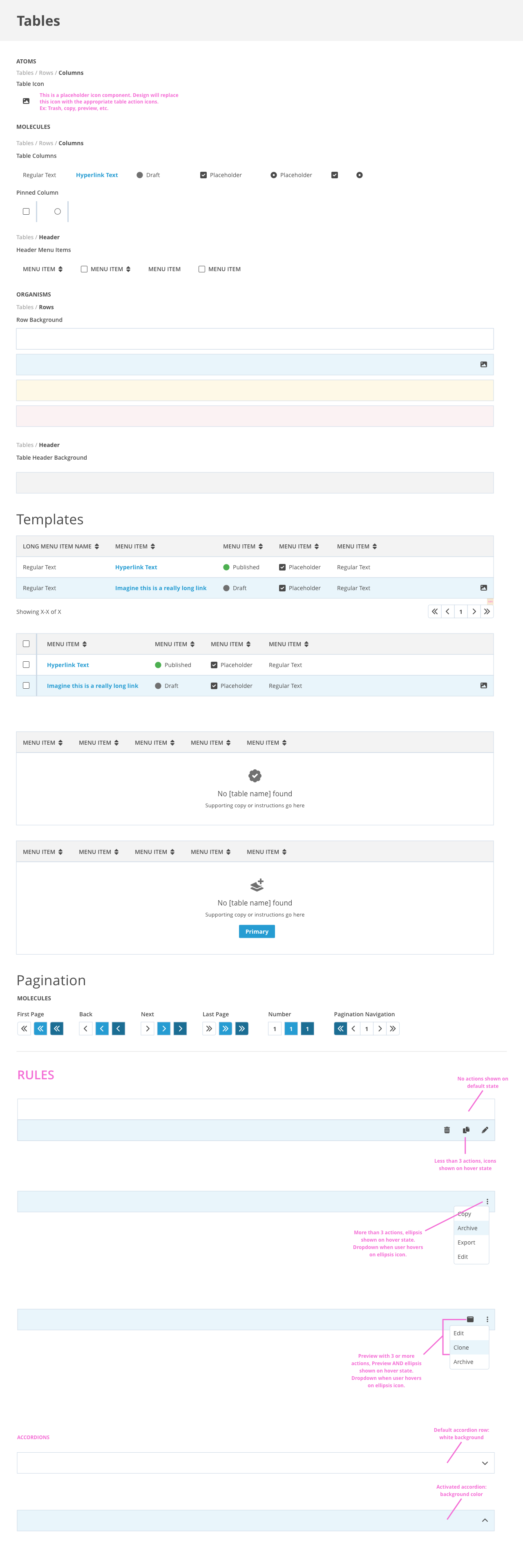
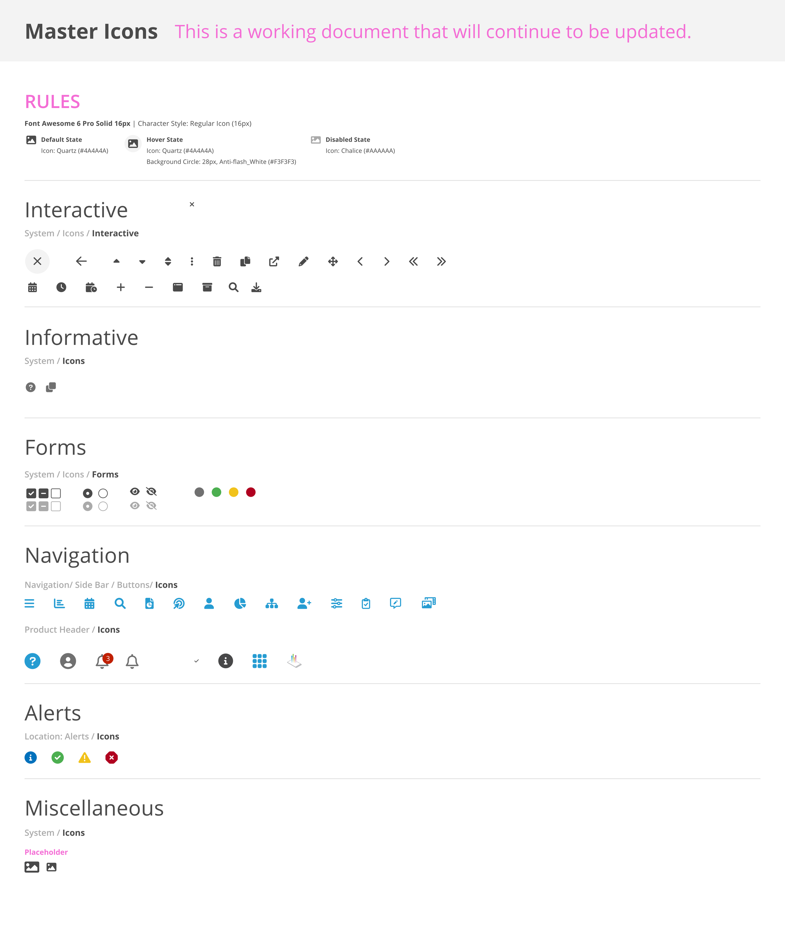
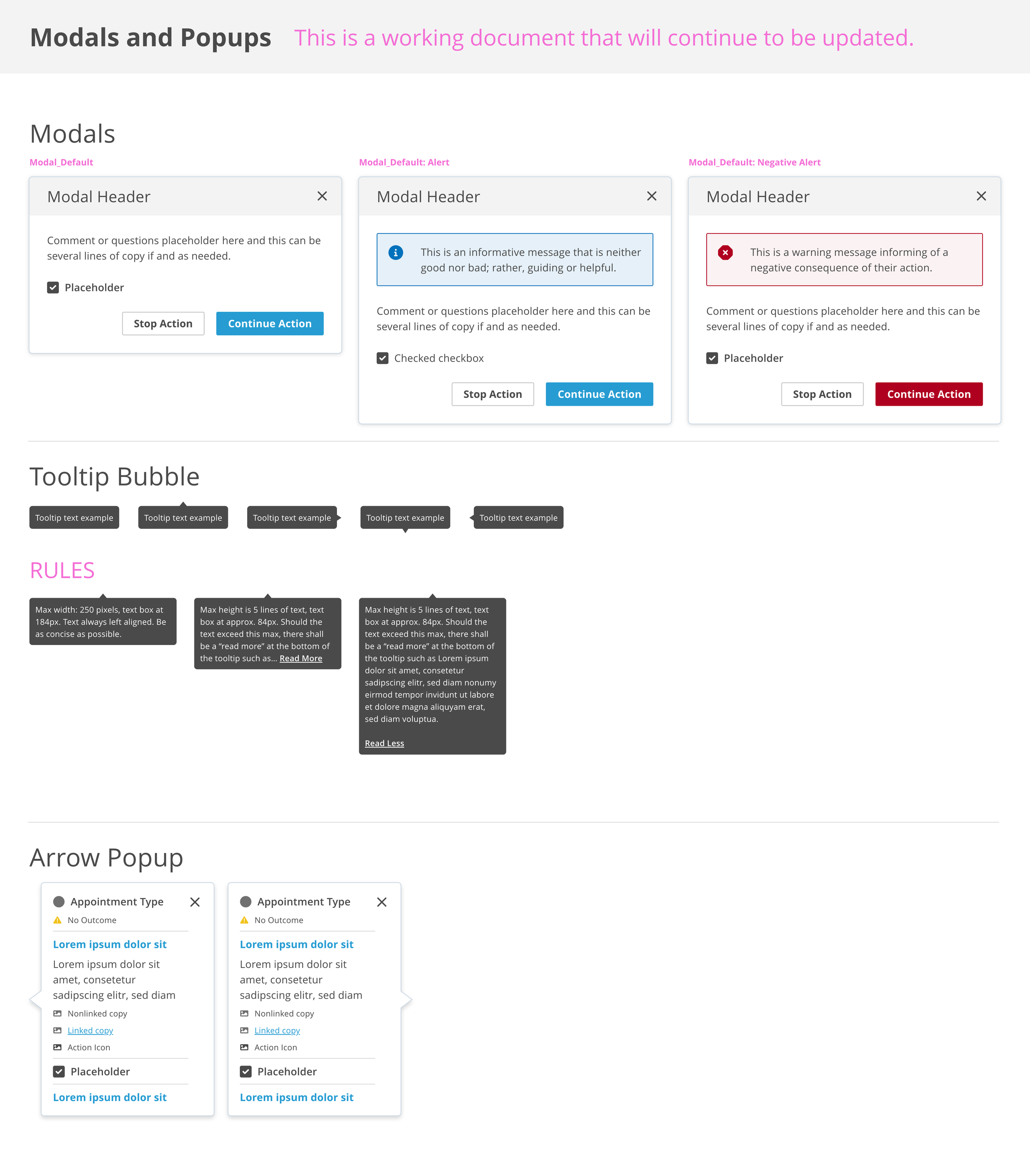
Component Library
Streamlined our workflow by creating pixel-perfect components with various states that can be dragged and dropped from our Adobe Creative Cloud Library into any XD file.
Utilized the atomic design and an easy-to-follow naming convention for scalability.
Detailed instructions for both designers and developers on do’s, don’ts, actions, states, use cases, etc.


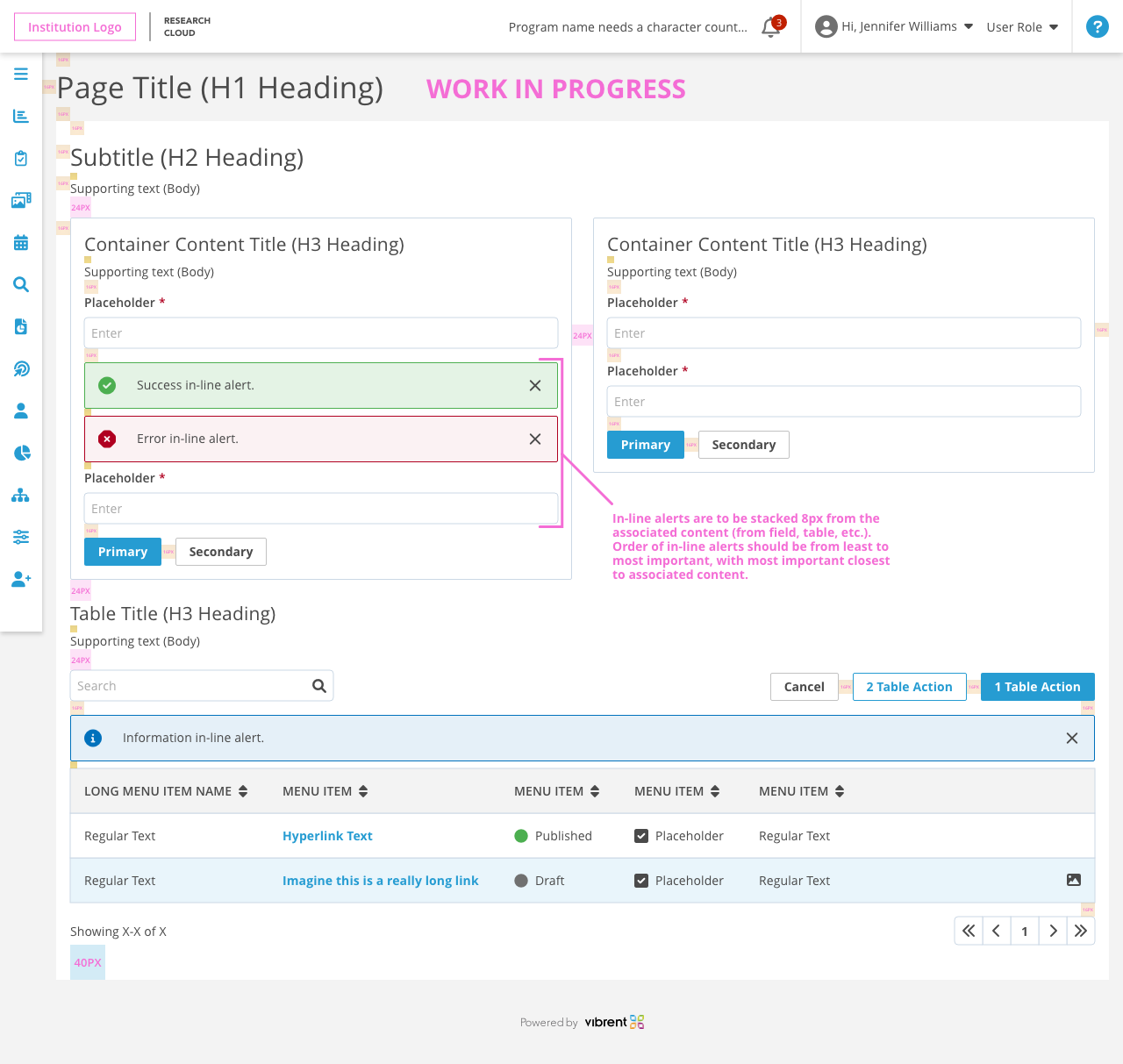
Cross Team Communication
Uploaded components into a Zeplin Styleguide for developers to inspect and reference as they are building screens.
I am currently building a requirements guide with spacing tokens and typography use cases to help templatize and standardize our layouts.

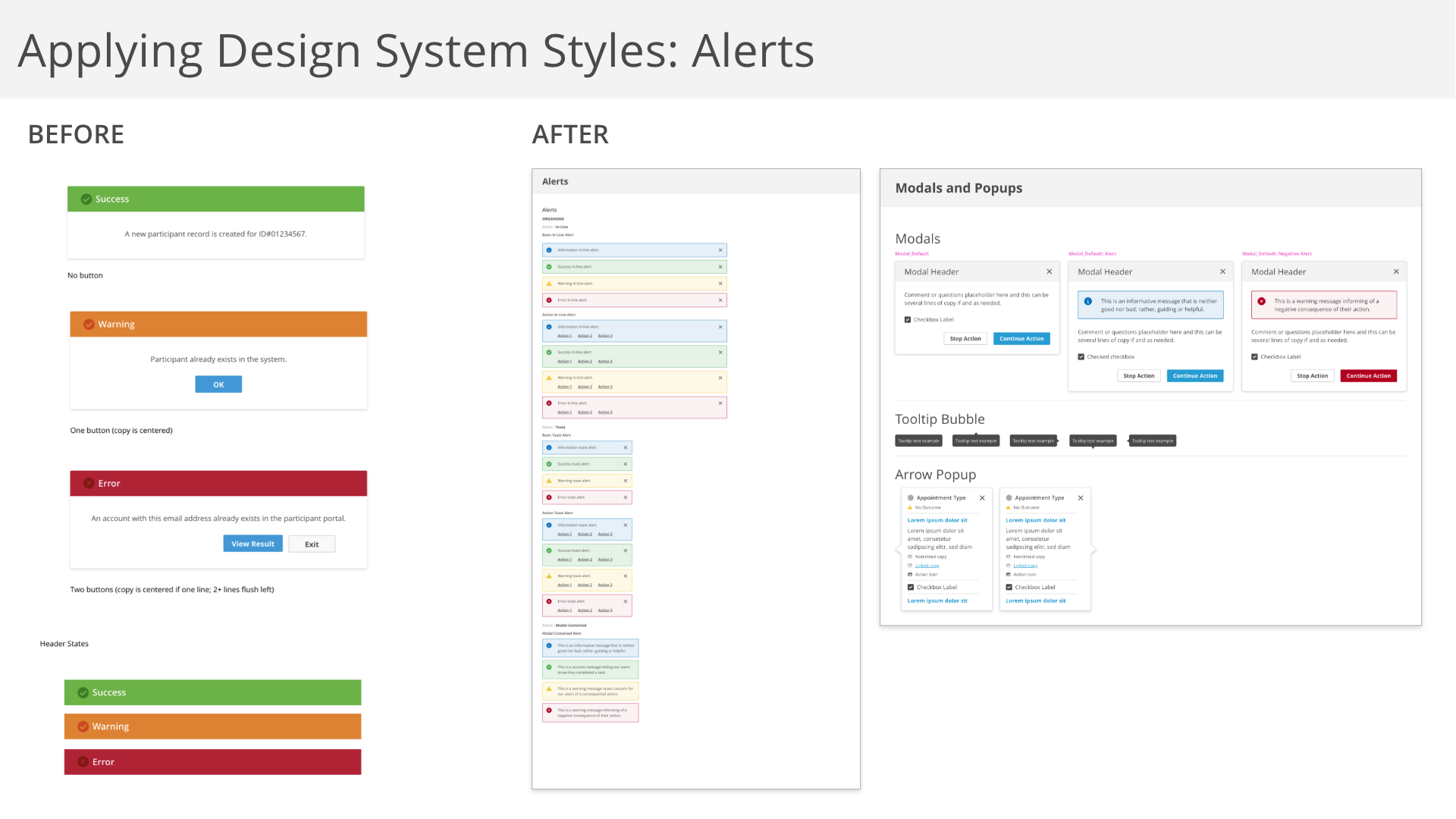
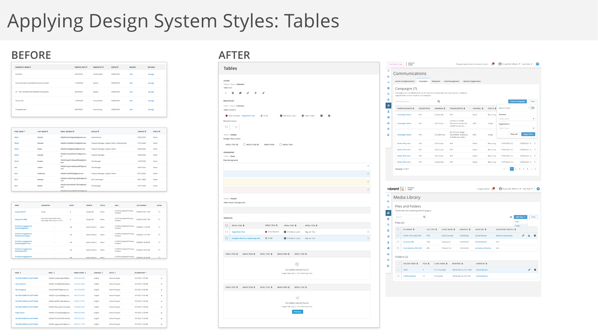
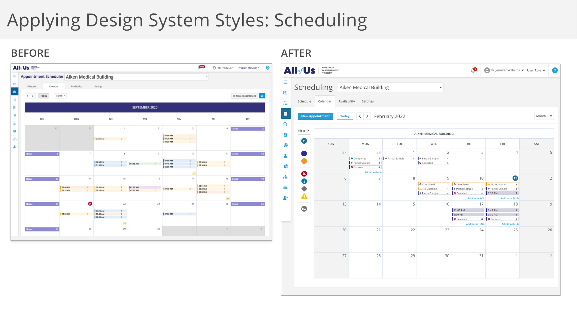
Before and After
This system is still new and very much a work in progress.
We are already seeing improvements in our workflow and receiving positive feedback from users on the upgraded look and usability.